
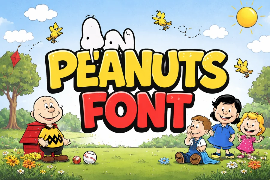
Peanuts Font Style Guide for Creative Design Projects
Peanuts font is commonly known in terms of attachment to the classic comic strip by Charles M. Schulz. The readers have been enjoying the story of Charlie Brown, Snoopy and Lucy, amongst other members of the Peanuts gang since decades and the lettering style of the comic has become as recognizable as the personalities. Even though the initial strips were created using hand-drawn lettering instead of a digital typeface, designers nowadays tend to seek fonts that can also be used to achieve the same adorable and nostalgic effect.
This comic-type lettering is characterized by its easy-going character and straight-forward design. The letters are easy, somewhat uneven, and of course natural, and this is what makes the text have a warm touch of a human. This style is personal and friendly compared to the inflexible modern fonts; thus, it is best suited to a project of playfulness or creativity.
The lettering style inspired by Peanuts still has an impact on design in various media due to a strong association with a popular cultural figure. In children books and greeting cards as well as in computer graphics and merchandise, this font assists the designers to provide a warm and nostalgic effect.
The History Behind the Peanuts Lettering Style
The typography style that is linked to Peanuts was initiated by Charles M. Schulz himself. As opposed to most other comic creators who had to depend on professional letterers, Schulz hand-lettered the dialogue in his comic strips. This provided the comics with a singular voice and the image that became easily identifiable.
Schulz had a straightforward and clean way of lettering. His letters were easy to read yet still had some imperfections that indicated that they were hand-drawn. These minor differences made the conversation seem more natural and expressive, in line with the emotional coloring of the characters.
With the growing popularity of the Peanuts comic strip across the world, readers started relating the lettering style with the mellow humor and considerate narration of the series. As time passed, designers and typographers tried to reproduce this appearance based on the original piece of art in digital fonts.
These computer versions are not the direct transcription of the handwriting of Schulz, and yet, they are supposed to reproduce the same casual air and light-hearted comic-book look. There are numerous fonts that have been based on the Peanuts lettering style that enables designers to recreate the vintage appearance of old newspaper comics.
Visual Characteristics of the Peanuts Font Style
The most appealing feature of the Peanuts lettering style is simplicity with a personality. The letters are made to be user-friendly, but also retain the hand-drawn effect to make them seem dynamic and expressive.
The letterings tend to be curvy and light-hearted and this makes them friendly tones that suit light subjects. The lines are not completely straight and this provides the text with somewhat comic rhythm when taken as a whole paragraph.
The other significant characteristic is spacing. Readability is highly necessary in comic dialogue as a reader has to comprehend a conversation within speech bubbles as fast as possible. The lettering style thus has a comfortable distance between characters such that the text is readable even in small sizes.
The result is a relaxed, human-feeling type style as opposed to a mechanical one. This is one of the reasons why the style still remains relevant to the designers who seek to bring the warmth and personality to the work.
Where the Peanuts Font Style Is Commonly Used
Those fonts based on Peanuts comics are frequently used in the works that are aimed at creating the atmosphere of cheerfulness and nostalgia. Due to the fact that the style is connected with childhood memories and traditional comic storytelling, it is naturally suitable to the designs that concentrate on fun, creativity, and coziness.
It is a common style by the designers in books aimed at children since it echoes the fun aspect of illustrated narrations. It is seen in greeting cards as well, and it is light-hearted with the assistance of the friendly lettering.
This style is also helpful in merchandise designs. Comic-inspired lettering is used on T-shirts, mugs, stickers, and posters in order to attract attention and leave the message casual and welcoming. The style can be used to make the material of learning materials less daunting to the younger audience.
This type of lettering is occasionally applied in digital design to social media graphics or themed campaigns where a retro or cartoon inspired visual identity is required.
Read More: Rae Dunn Font Style and Its Rustic Charm
How Designers Use Comic-Style Fonts Effectively
Comic fonts are difficult to use without deliberate design decisions. Since the fonts already have high personality, it is best used with simple layouts that make the text to naturally shine through.
A playful font is used together with a neutral and clean typeface by designers. This contrast is used to keep the visual balanced and also to make sure that important information is not lost. Too many decorative fonts are displayed all over the place resulting in the design becoming overwhelming.
The color also has the effect of the perception of the lettering. The comic-style fonts are rather friendly so bright and cheerful colors are likely to suit them. The nostalgic effect of the old cartoons can be also facilitated by soft pastel colors.
The other consideration is context. Though the style is very effective when it comes to fun and casual designs, it might not be applicable when it comes to serious business communication. Tone enables the designers to determine when this amusing lettering style is suitable.
Digital Fonts Inspired by the Peanuts Comic Style
Even though the first comics of Peanuts were hand-lettered, there are numerous digital fonts, which are trying to duplicate this look. The designers of these fonts analyze the structure and rhythm of comic lettering and bring them to the digital world.
A few fonts are dedicated to the precise re-creation of the touch of old comic strips, whereas others just appropriate the style including round forms and informal lines. Such diversity enables designers to select a typeface that suits their project and at the same time attains the essence of Peanuts aesthetics.
A lot of these fonts are available on the well-known font libraries and design markets. Others can be used in personal use without a charge, whereas others need a license when used in commercial projects.
Following the choice of a font that used the Peanuts style, one should consider the terms of the license. By making sure that the designers use fonts that are properly licensed, the designers do not violate the rights of typographers and their own works are not at risk of legal action.
Final Thought
The personality and simplicity of the Peanuts font style provide the timelessness of the font style. This comic-style typography, which was inspired by the hand-drawn lettering of Charles M. Schulz, still has an effect on designers who wish to render their work warm, nostalgic and creative.
Although the original letter was never a computer typeface, its essence is being carried on by modern-day typefaces that recreate the friendly nature of this typeface. This style can help to make a common design feel playful, friendly and memorable when used judiciously.
FAQs
What is the Peanuts font?
The Peanuts font refers to lettering styles inspired by the hand-drawn dialogue used in the classic Peanuts comic strip created by Charles M. Schulz.
Did the original Peanuts comics use a digital font?
No. The original comics used hand-lettered dialogue created directly by Charles M. Schulz rather than a digital typeface.
Why is the Peanuts lettering style so recognizable?
The style is recognizable because of its simple shapes, friendly tone, and its strong association with the popular Peanuts comic strip.
Can designers use Peanuts-style fonts in their projects?
Yes, designers can use fonts inspired by the style, but they must follow the licensing rules of the specific font they download.
Where can I find fonts similar to the Peanuts lettering style?
Fonts inspired by comic lettering can be found on many font marketplaces, design resource sites, and free font libraries.
Is the Peanuts font suitable for professional design work?
It can be suitable for creative and playful projects, but it is generally not recommended for formal or corporate designs.