
Chick Fil A Font – Style, History, and Brand Impact
The Chick Fil A font is one of the most recognizable logo styles in the fast-food industry. Its scribbled appearance catches the eyes of everyone at a glance, reminding them of the well-known chicken sandwich brand, and this can be considered an advantage of the company in the saturated market. Typography is a strong branding tool, and a unique script design employed by Chick-fil-A appears friendly, easy to approach, and to remember.
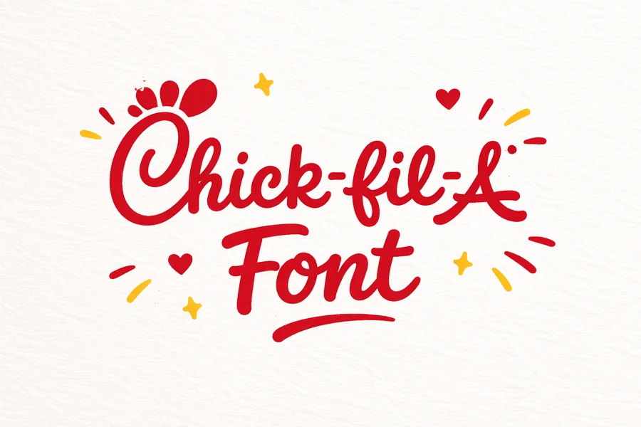
The peculiar font of the logo of the brand does not escape the attention of many individuals, particularly the innovative application of the letter C that looks like a head of a chicken. This is a smart design aspect which supports the concern of the restaurant about chicken and makes the logo easy to recall and attractive.
In this article, we’ll take a closer look at the style behind the Chick Fil A font, how it developed over time, why it works so well for branding, and what similar fonts designers can use if they want a comparable handwritten feel.
The Origin of the Chick Fil A Font
Chick-fil-A brand is an American company, which was established in 1967 by S. Truett Cathy. Since the inception of the firm, the firm sought to develop a warm and receptive image. The brand did not go to an ordinary corporate typeface but rather applied handwritten logo, which portrayed character and coziness.
Unlike many logos that rely on commercially available fonts, the Chick Fil A font was custom designed. Original designs were based on the handwriting of Truett Cathy so the logo had a personal aspect. This strategy contributed to making the brand closer and more real among the consumers.
The logo has been perfected and modernized over time but the main handwritten style has stayed the same. This has enabled the brand to retain a solid recognition over the decades yet be in line with the current design trends.
A distinctive handwritten style of the font also indicates that the company focuses on hospitality and friendliness as the major elements of the Chick-fil-A brand.
Key Characteristics of the Chick Fil A Font
The design of the Chick Fil A font includes several distinct features that make it stand out from typical restaurant logos.
To begin with, the font belongs to the style of a handwritten script. This makes the logo look relaxed and friendly and the customers can associate the brand with feeling warm and treated like family.
Second, the lettering is rounded and smooth. There are no sharp edges or hard lines, but the shapes of the characters are moved into each other. This flowing style generates the feeling of movement and dynamism.
The other significant feature is the creative chicken in the letter C. The logo also intelligently works around the first letter to look like a chicken head with a comb, which supports the theme of chicken products in the restaurant.
The font is also bold in nature and therefore you are able to see it clearly even when it is far away. This is particularly significant to signage, packaging and even advertising materials.
Combined, these aspects form a unique visual identity that the customers can identify at first sight.
Why the Font Works So Well for Branding
Typography is very important in influencing the perception of a brand among people. The Chick Fil A font works effectively because it communicates several important brand qualities at once.
Memorability is one of its success factors. The logo is memorable due to the handwritten style and the unusual shapes of the letters. The customers tend to think of the brand immediately when they are exposed to the similar script letter writing.
Emotional connection is another variable. Script fonts can be more intimate as compared to normal fonts. As Chick-fil-A logo looks like handwriting, it creates a sense that the brand appreciates genuineness and human touch.
The font used also serves to support the friendly and welcoming image of the company. Customer service is a favorable feature of the work of Chick-fil-A restaurants, and the visual assisting of the image are soft and flowing letters.
Lastly, the logo design is applicable. It is effective in a wide range of platforms, among them being store signs, online advertisements, packaging, mobile applications, and social media illustrations.
Read More: License Plate Font Guide – Styles, Rules, and Uses
Fonts Similar to the Chick Fil A Style
Since the Chick Fil A font is custom made, it isn’t available for download as a standard typeface. Nonetheless, designers tend to seek similar script fonts that have a similar appearance and feel.
Chicken Hut, Lobster, and Sofia Script are some of the fonts that resemble each other in terms of style. These typefaces have flowing handwritten figures and heavy lines that remind the good nature of the Chick-fil-A logo.
Pacifico is another alternative popular script font and is applied in most branding and design projects. It is smooth and rounded in style and suitable in logos and casual type.
The criteria that designers can use to select a similar font are smooth curves, connected lettering and bold readability. These features contribute to the creation of the same friendly and approachable impression that the Chick-fil-A logo creates.
But one should bear in mind that the original logo design is a trademark one should only be inspired by these fonts and not copy them.
The Role of Typography in Restaurant Branding
The success of the Chick Fil A font highlights how important typography can be in the food and restaurant industry. An elegant logo font does far more than just point at a brand name, it conveys a personality and values.
The competition in the fast-food market is high. Restaurants need to draw attention within a short time, which can be a driver that has slowed down in front of signage or a client that is scrolling through delivery apps. One of the fonts that make a brand stand out is unique.
Typography determines brand perception too. The fonts of the scripts used are usually friendly and informal, and the bold fonts of the sans-serifs can be considered as modern or effective. The handwritten approach by Chick-fil-A is a sign of hospitality and kindness, which is just the best fit in the customer-oriented culture of the company.
Another important consideration is consistency. Chick-fil-A has developed a good brand name because the company has been using the same logo style over decades. The restaurant can quickly become familiar to the customers when they are only exposed to the logo in passing.
This demonstrates how considerate typography decisions can be used to promote the success of brands in the long-term.
Final Thought
The Chick Fil A font is more than just a logo style—it’s a powerful branding tool that has helped the company build a strong and recognizable identity. The brand values and customer experience are accurately reflected by its handwritten look and creative design features as well as friendliness in its tone.
The logo has been slightly modified over the years although the basic style of writing has not changed much. This is the harmony between the traditional and contemporary sophistication, which has enabled Chick-fil-A to remain recognized by the brand name, but also remain pleasing to the eye in a transforming design environment.
To designers, the logo is an excellent illustration of how typography can be used to convey personality, strengthen brand communication and imprints memorable impressions. The Chick-fil-A logo has a lot to teach you on how to do effective branding, or even find new font inspiration.
FAQs
What font is used in the Chick-fil-A logo?
The Chick-fil-A logo uses a custom handwritten script rather than a publicly available font, making it unique to the brand.
Can I download the Chick Fil A font?
No, the original logo typeface is proprietary and not available for public download because it was specifically designed for the brand.
Are there fonts similar to the Chick Fil A style?
Yes, fonts such as Chicken Hut, Pacifico, Lobster, and Sofia Script share a similar handwritten appearance and can be used for design inspiration.
Why is the Chick-fil-A logo font handwritten?
The handwritten style was inspired by the founder’s handwriting and was chosen to create a friendly, personal, and approachable brand image.